Up to now, my favourite and most trust-worthy going-out handbag is a small Vuitton Vernis pouch. While I'm not big on monograms, I do think that the monogram on Vernis isn't as obvious or popular as the typical tan-coloured monograms. But what I really like about the Vernis bag is that it's made of patent leather, meaning that it's not 'the end of the bag' if someone spilt a drink on it. Plus the shininess of patent leather just somehow seems to suit going-out at night. But after using it for a few years, it's beginning to turn yellow and just recently at the back of Teen Vogue, the Vuitton ad was advertising this new Vernis bag:
 On first glance, I thought it looked like a pretty and practical going-out bag that could last at least four seasons. But right in the centre of the bag, there's gold piece of metal that says 'Louis Vuitton'. In my mind, that's a con.
Unfortunately, having this big piece of metal on bags seems like a thing Marc Jacobs has been favouring in the recent seasons, whether it's at Vuitton...
 or Marc Jacobs. Honestly, when I first saw those Marc Jacobs bags in real life, I remember thinking, 'That's ugly. Why would MJ add that brand-named-metal on such nice, contemporary bags?' And is it really necessary? It's usually pretty obvious when a bag is by Marc Jacobs (to me anyways.)
  MJ seemed to have started these metal tags a few seasons back with Vuitton's canvas bags. I remember really not liking the tags back then. The thing is, it's understandably harder now for designers to differentiate their bags in the market from high street ones, especially when high street stores manage to produce the bags so quickly and some stores (eg. Zara) actually manage to make the bags to not look cheap. But is this really what designers are offering us now?
 This season, Marc by Marc Jacobs has shrunk their metal tag smaller into this 'standard supply' tag, which is kind of an improvement from last season's metal plates (literally). (If you've visited a Marc boutique last season, you would have probably noticed some of the bags had HUGE Marc metal plates on them.)
 Gucci has stitched on italic 'Gucci' on some of its bags in recent seasons too. But for some odd reason, it seemed more artistic and prettier than the Louis Vuitton metal tags -and I'm not even a fan of Gucci bags. (The picture here has a huge 'Gucci' name on it. The Gucci bags I'm referring to have smaller ones stitched on.)
Anyways, back to the first Vuitton bag on the top of this post, what does everyone think about it? I can't decide whether the gold metal tag is horrible enough to make me stop considering it!
Image credits: www.louisvuitton.com, www.guicci.com, www.shopbop.com, www.marcjacobs.com, www.saksfifthavenue.com


 My favourite was surprisingly Kate Hudson's dress. OK, so her hair is admittedly a bit werid (-it's so shiny and sleek but it looks like something's off about it,) but I love her dress! It's so pretty and flowy-looking. Plus it's got that graceful, bohemian feel to it.
  Marcia Cross was gorgeous as usual. Her hair is so perfectly curled. And even though she's wearing green again, that dress has got such gorgeous draping.
  Not sure about that hairstyle on Eva Longoria, but this white, backless dress fits her amazingly, as usual. Not a particularly interesting dress though.
  Normally I'm not a fan of Debra Messing's red carpet outfits, but I thought she carried off this Oscar de la Renta dress well. I think it's because the gold colour and those embellishment compliment her skin and hair colours well. But the point is, she's looking great and sparkly!
 Both Kate Beckingsale and Vanessa Williams wore yellow, but the effect turned out to be very different. Kate looked really elegant and lady-like; kind of Valentino-esque. Vanessa looked feirce -the power of Versace!
 I'm not sure how to feel about Amanda Bynes' outfit here. The dress is pretty and fits her well. And her hairstyle is very fun and elegant. But for some odd reasons, the dress kind of reminds me of American prom dresses, (a riduclously well-made prom dress of course.)
 Michelle Pfeiffer's outfit looks plain, but everything fits so well and match perfectly. Maybe it's not the most interesting outfit around, but she looks fantastic. I can't get over how she's almost 50 years old!
 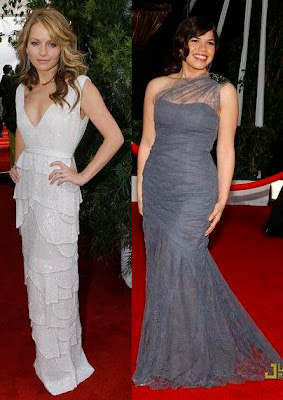 Becki Newton's white dress is my other favourite dress. I love how it's got such a classy silhouette, but the tiered skirt bit gives it a much more youthful and stylish touch. Loves it!! Plus, I love her perfectly curled and styled hair! (And her Amanda smirk!) As for America Ferrera, I really think she could have done better. Grey and lacy dresses like that should be left for the more mature ladies.
  To end this post, I chose this fun photo of Olivia Wilde. I actually really like that dress, and the cool tone matches her cool brunette hair so perfectly!
 Take note of the Phillip Tracey hats -they're so pretty! Isn't the bow on Natalia V.'s head SO adorable? I could totally imagine a red one on Blair (Gossip Girl)!
 OK, so I admit I can't tell the difference between this collection and Valentino's RTW line. They just all look very lady-like to me.
 The gold, 20's dress on the left is one of my favourite from this collection. It's modern but still very classic-looking.
 Flowers in many different forms -a signature of Valentino's.
 Chic and elegant.
 Gorgeous! Don't the purple/ pink flowers just look like they're growing on a vine on these dresses?
 These dresses look so big and puffy, yet still so light and floaty. Just what certain romantic dresses are supposed to look like.
 The silver (or is it white?) dress on Vlada (right) is another one of my favourite dresses in this collection. It's SO gorgeous!
 Farewell Valentino!
 The jewel colours are SO gorgeous. Gosh, imagine all the work put into constructing the dress and all those little details!
 These are great to look at (in an artistic way) and very unwearable.
 Don't the models look like they're wearing super-volumous dresses with capes on? And please don't tell me that the grey dress (left) is made of animal skin because that's just scary. (Hmm, maybe I should look up a closer-up photo.)
 Aww, these are so cute and girly! (-in an expensive and unrealistic way of course.)
 Huge shoulders.
.jpg) Soft and see-through.
Soft and see-through..jpg) Pencil-dress and menswear.
Pencil-dress and menswear. The suits look somewhat impractical. Good thing people don't actually wear these, but if only we could wear cute, bubbly suitskirts to work!
 I especially love the cocktail dresses -so divine! Sigh.
 Cocktail dresses as art pieces.
 As for the long gowns, they're feminie and glamorous as always.
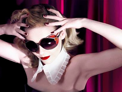 The colour scheme of the SS08 campaign seems pretty similar to the FW07 one. But what I like about this campaign is that it really conveys the feeling of the clothing collection - the clothes and bags are very obviously featured, but it still manages to be artistic and dramatic. Also, I think Kirsten did really well. She manages to look coy, theatrical and ladylike while still looking playful. (You have to stare at it for awhile before really feeling the images. Go to the Miu Miu website for larger pictures.)
  Now I don't actually love all the images, but I like the campaign as a whole. Plus I may be biased as Kirsten is my favourite actress. And while it would be nice to see Miu Mi
 I want to say this looks like a good 'look' for work (minus the red bow on the head,) but the skirt is way too short. If only I could go to work looking this chic though! Even the bag looks big and practical for work!
 Hmm, I couldn't decide whether I like this image (top)...
 or this image (top) more. But these two are definitely my favourite out of the lot. The clothes are SO cute, girly and quirky. I just don't know where one would wear them. Oh well, it's not like I could afford these clothes.
